Top 5 bank
Top 5 bank
Responsive redesign reaches millions of users
-
Role
Digital Product Designer, September 2021 - January 2022
-
Responsibilities
Design mobile and desktop fat navigation and prototypes, user research and testing, craft responsive redesign style kit, wireframes and high-fidelity design of responsive pages.
-
Overview
I joined forces with the company’s Responsive Redesign XD team to explore ways to improve and refresh usability, information architecture, and visual design on their responsive .com site.
The Need
The company’s website design hasn’t been updated in about 10 years. To stay competitive and continue to cater to its 15 million online banking users, it needed to modernize and undergo a total redesign. The first step was to analyze the existing navigation, test its strengths and weaknesses, and update according to new brand standards.
Site Navigation
Find the problem, explore the solutionsThe organization needed a concept for what direction to take site navigation. After completing a thorough competitive analysis and extensive research on fat navigation preferences, we started straight at the source; the users. Usability testing was conducted for both desktop and mobile navigation and the studies found that navigation issues stemmed primarily in mobile.
Mobile users couldn’t easily find the information they were looking for and it was apparent that the site required a complete redesign of its information architecture as well. 64% of users reported issues with differentiating categories and between different lines of business as well as trouble navigating to the homepages. Taking these two major factors into consideration, we came up with the following solutions:
Add text prompts ‘menu’ and ‘close’ to hamburger menu to increase findability
Include screen peeking so users have visual cues to understand location within navigation
Create a clearer visual text hierarchy using more differentiated font weights, colors, and lines to separate categories
Open menu at Personal homepage as it is the landing page of the site - also where more than 90% of users go
-
Option 1
Users didn’t understand how to navigate to homepages using the open / close and had difficulty distinguishing between categories.

-
Option 2
Replacing the minus symbol with a chevron solved the navigation to homepages but text hierarchy and differentiation of categories remained unclear.

-
Option 3
Removing open / close created a cleaner and more intuitive interface and using color to separate categories in use eased use of navigation.

Mobile Navigation Defined
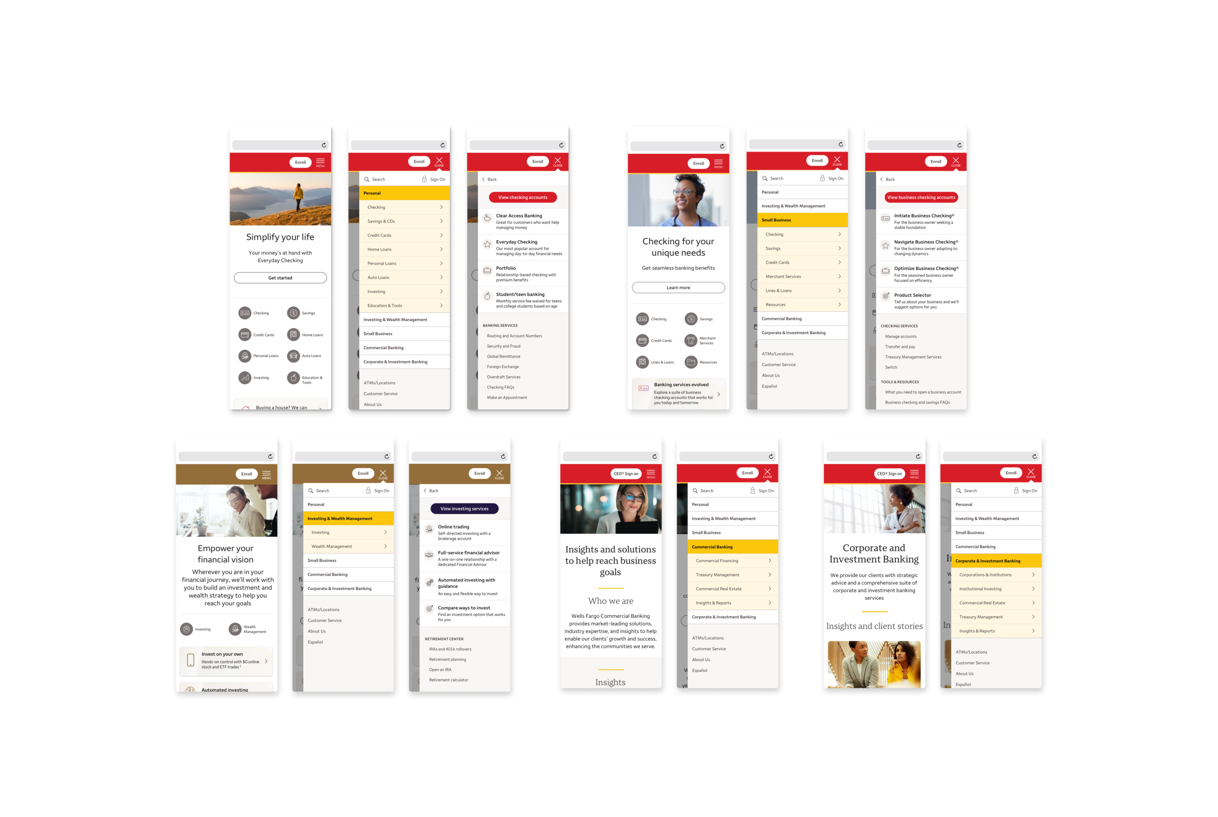
With content established, working with product designers on my team, I developed the mobile navigation pictured below, incorporating updated page designs and the new navigation scheme. The navigation was tested using complex prototyping methods to demonstrate the navigation in use and ensuring that it was intuitive, easy to use, and functional for user purposes. The prototypes were used throughout the organization, helping to unify ideas and clearly illustrating what was needed from a development perspective. Overall we were able to achieve an improved navigation process for users.

Modernizing Content
Creating new content to match the new brand image After completing usability testing and establishing the navigation design, we also focused on site navigation content. I worked closely with the Content Strategist to analyze current content, work closely with the lines of businesses to come up with a refreshed version of content, and determine if options were viable from a design standpoint. I assisted in updating copy decks and providing high-level mockups for desktop and mobile navigation to later incorporate into the copy decks to use a point of reference for key stakeholders, the different lines of businesses, and developers.
Desktop Navigation
New Content in ContextWith updated content, I designed and updated the desktop navigation. I built out advanced prototypes for desktop navigation, demonstrating the implementation of the dropdown navigation menu and how users could interact with the site and successfully navigate to desired pages. Many versions of the prototype had to be built, to test micro interactions and accounting for deadlines and developer restrictions. The final scheme is demonstrated in mockups below.
Creating a Component Library
Highlighting the importance of unified design standards, accounting for all device sizesWith the homepages and navigation fine-tuned and established, it was time to look at interior pages and continue to build out the Responsive Design Kit, particularly to identify and build out components that we needed to incorporate within the pages. We completed a thorough analysis of the current webpages, aligned the priority pages according to our roadmap of release dates, to determine needs and use cases for each component that we were tasked to design.
I was assigned to a number of components, starting with determining the need, use cases, and completing a competitive analysis for each one. From there, using the Style Guide as a reference point, I took a mobile first approach to designing the components, and updated them for 5 different pre-determined breakpoints.
Below is an example of the show / hide component.
Internal Page Updates
Bringing it all together, new brand guidelines and a new brand imageWorking from the new Responsive Design Kit and incorporating new components that my team and I designed, it was time to bring it all together and start wireframing, updating content and information architecture, component mapping, and designing the internal pages. We worked to identify priority pages and created a roadmap with varying release dates depending on our capacity and developer restrictions.
Diversity, Equity & Inclusion
The Diversity, Equity & Inclusion page was one of the first priority pages to be released. The page represents the company’s desire to show their internal values to the external world, ensuring that they are accurately presented as the diverse and inclusive company that they are.
I started by developing wireframes to map out the new content and identify what needed to be included on the page. It was important to highlight an hierarchy of most important information while relaying our message. I incorporated the new brand typography, colors, and components and also used company stock photography demonstrating a wide variety of people from all socioeconomic classes, ethnicities, and backgrounds.
Below is the page before and after, clearly showing the need for improvement and modernization and obtaining the voice to represent the company’s core values.
About Us
The About Us page was another high priority page set to launch in early Q2. This is another highly visualized page that focuses on elaborating on the company’s history and community involvement, sharing stories about their people, volunteering, and outreach programs.
We wanted this page to accurately represent the company’s history, values, and accomplishments, catching the reader’s attention by drawing them into the story. For this reason, we decided to highlight customer success stories as the hero image of the page, using graphics to portray the objective of employees and their commitment to help their customers.
We also wanted to make the core mission of the company stand out. Below represents the before and after of the page, clearly illustrating how redesigning a website helps a brand to achieve sending an accurate message and representation of how they operate and what their values are in the present.
Key Takeaways
As it is such a large corporation, there are a lot of moving parts and an ever-changing roadmap, things move slowly and approvals are difficult. These variety of factors showed me the importance of organization, keeping the team looped in on the timetable, maintaining an up-to-date style guide, and the power and advantages of Figma.
The design work was handled between multiple designers, and the company was using Sketch. Files were often transferred between employees and much time was lost uploading and downloading. The style guide was updated endlessly and the “source of truth” was lost due to all of the transfers. This demonstrated the efficiency and necessity of using a web-based design tool like Figma, which reduces the questions around versions and unifies the team using one uniform style guide.
I learned a lot working at this bank, and was able to dip my toes in many different areas including; copywriting, protoyping, wireframing, creating a design system, creating symbols, creating flexible components, and visual design. It took effort to get everyone in such a large company to share a common vision, but with the right organization, tools, and empathy, it was possible to do so.

Next Project


