Leading manufacturer
Leading manufacturer
Designing a “one-stop-shop”
Overview
Taking on the task of facilitating the ordering and account management process for customers in the aluminum can industry by creating an internal B2B portal.
My job: Discover what customers want to know, prioritize new key features, develop intuitive interaction patterns, and build an interface that delivers information in a simple and delightful way.
Role
UX / UI Design Lead
March - Present
1. Research
Nailing down objectives
Defining the users
Our client manufactures and sells to commercial and industrial customers across multiple markets within the beverage sector.
Users are professionals in; product management, operations, supply chain and procurement, packaging design, forecasting and planning, product scheduling, and logistics.
They rely heavily on the accuracy of information and need to access ordering and information related to their account in an intuitive and straightforward way.
We made sure to identify a variety of user personas to truly get a better idea of their needs.
Examining usability test results
Usability tests were performed by a UX resource before the release of the portal. The following were key pieces of customer feedback to take into consideration moving forward with the project:
Heuristics Evaluation
To ensure a solid UX foundation to work from, a Heuristics evaluation was performed to test the portal’s usability and efficiency.
Takeaways
The main issues from the site stemmed from consistency and standards, decreasing consumer confidence and creating a gap between user needs and what the company was currently offering. I prioritized tackling the most important issues found first before adding on any new features.
-
Problem #1 - Design Inconsistency
As developers had been working without high-fidelity designs, design was not standardized throughout the platform. This marked a real need to regain control of styling to create a unified system and brand that met customers expectations and assumptions.
-
Problem #2 - Confusing Navigation
Reviewing usability testing studies, there were examples proving that the current navigation scheme implemented was not user-friendly. Users had a hard time finding categories and a lack of hover states signaling the selected dropdown menu made it difficult to keep track of their place within the nav.
-
Problem #3 - Missing Key Features
Feedback from our pilot customer as well as during UAT throughout various stages, new features and requirements came up that proved to be essential to customer success.
2. Site improvements
Styling and consistency
Design audit
Creating a Style Guide
The design audit revealed the necessity of creating a more in-sync and robust style guide. The current version on Sketch contained some styling, such as color palettes and typography, but was missing key items such as alignment and spacing and building out set components.
Fonts: Clean and light typography was chosen with colors meant to evoke a subtlety to clearly display complex data and customer information.
Colors: The color palette included brand colors, subdued tones to add dimension, and brighter accent colors used in alerts and notifications.
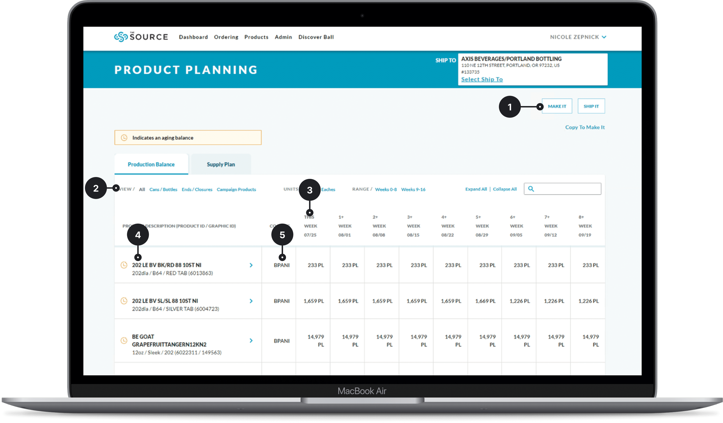
Date picker: A date picker implemented by weeks to accommodate planning and orders accordingly.


3. Redefining navigation
Meeting expectations
Identifying areas for improvement
Customer feedback
Unable to find categories easily
Differing expectations on what to find under each category
Confusion over the “Summary” pages
Unclear distinction between sections
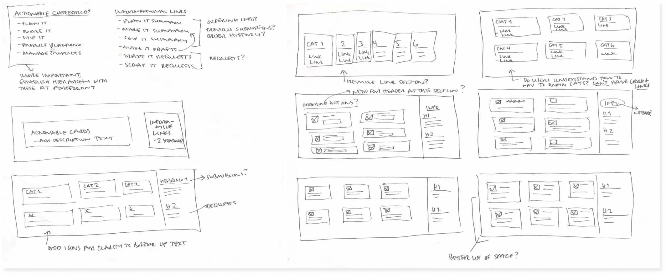
Wireframes
Iteration 1
+ Combining category with summary pages removes links
+ Keeps categorized items together
- Card behavior not clear with introduction of links
- No separation between action items and informative sections
Iteration 2
+ Heavily trafficked sections kept to the left for easy access
+ Sections divided to keep informative links and action items separate
- Stacking icon on top of text increases height of dropdown
- “Ordering Information” heading doesn’t accurately represent all links
4. Adding new features
Managing changing requirements
Manage locations
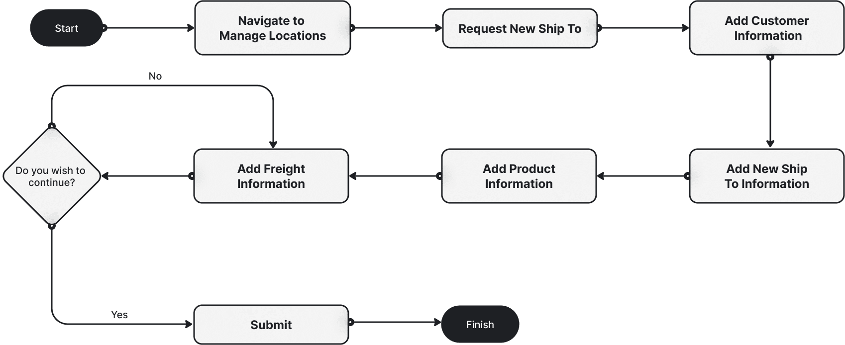
Customers expressed the need to view the locations associated to their account in a clear manner. They also wanted to be able to set up new locations and edit other key account information.
Below is the User Flow built for the experience of adding a new location to the customer’s account. This will allow customers the ability to ship products to new businesses.
Identifying key elements
With the main workflow mapped out, I collaborated with stakeholders, BSAs, and customers to identify necessary data to capture in order to successfully complete the request.
Key takeaways
Understanding user needs
Importance of a UX/UI resource
Navigation is key to success
Cross-functional teamwork


Next Project


